Visualization Design
By iCareer Climber Team on 6 July 2018
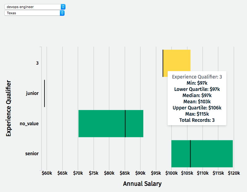
Salary Barchart
Visualization | Code Built using D3.js
This visualization allows the user to see salaries from the past 5 years for their state (or nationally). Salaries are grouped by any “job qualifiers” on the job titles and “no_value” indicates a job has no job qualifiers. The bars show lower quartile, upper quartile, and median. The tooltip gives additional metrics.
Next Steps - Create a visualization that shows jobs with decreasing/increasing demand and salaries.
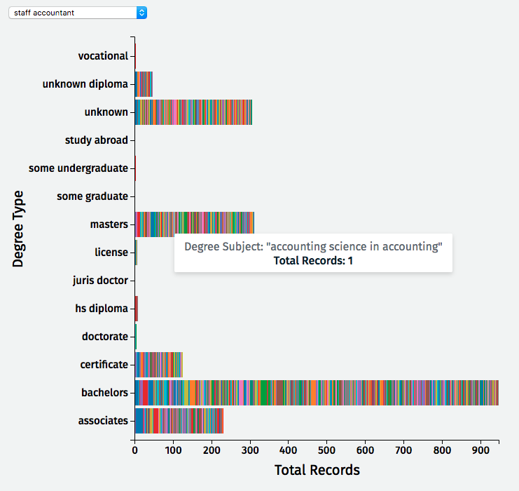
Education Barchart
Visualization | Code Built using D3.js
This visualization shows a breakdown of the education on resumes. Education records on resumes are used if the graduation date (or end of education date) occurs prior to the job start date. Each color represents a different degree subject and the size of each color represents the number of people with that degree. The tooltip tells you those details.
Next Steps - Add identifier for STEM versus non-STEM degrees.
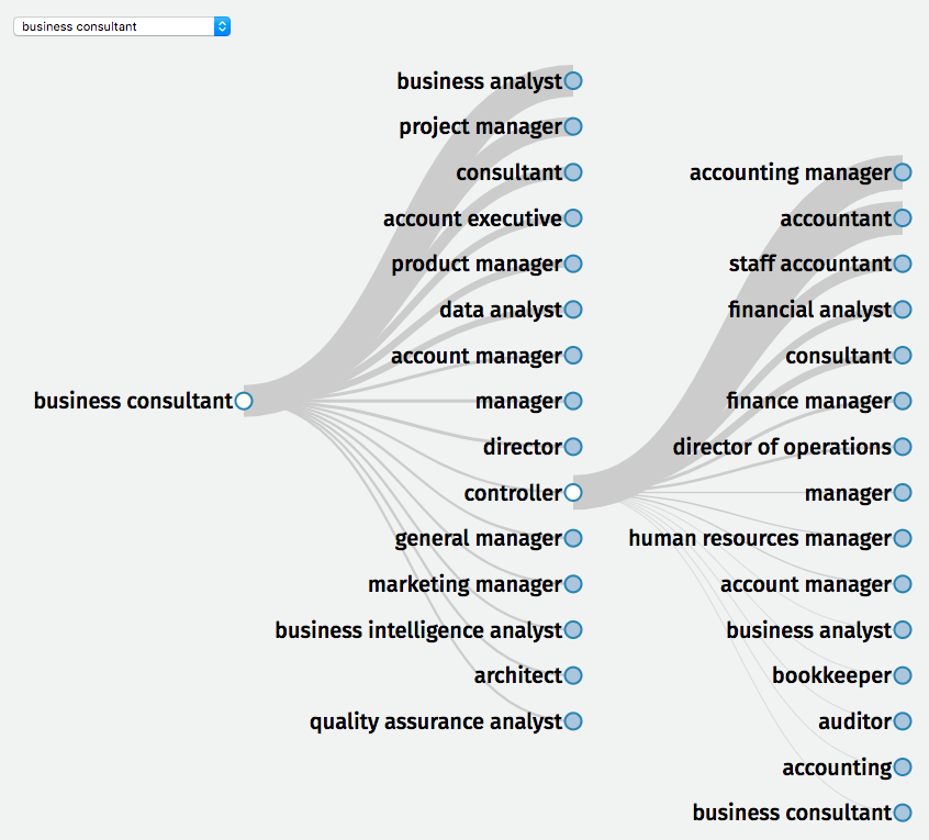
Job Title Hierarchy Tree Graph
Visualization | Code Built using D3.js
This visualization shows the most common next step for each job. Due to data constraints, the chart only shows the most common jobs stemming from each node and not from the root node.
Next Steps - Collect more data to show multiple steps from the root node. Update visualization to include average length of time spent in each job.